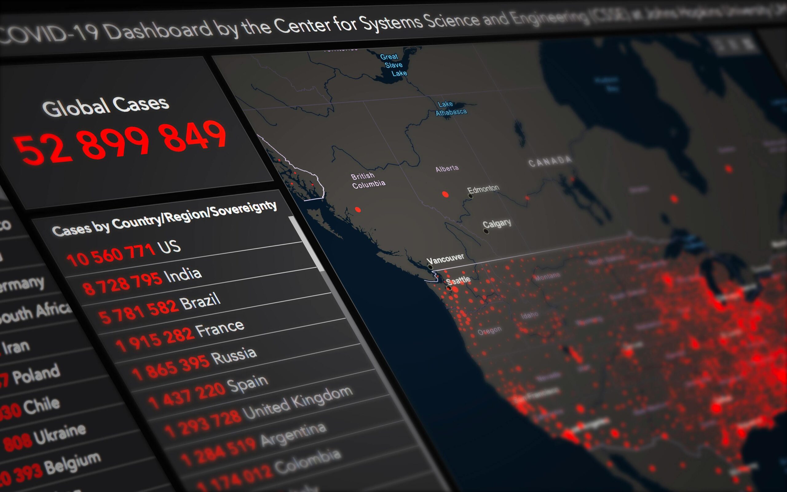
In today’s fast-paced digital landscape, organizations generate massive amounts of logging data every second, making real-time visualization dashboards essential for instant insights and proactive decision-making.
🚀 The Evolution of Real-Time Data Monitoring
The traditional approach to log management involved collecting data, storing it, and analyzing it hours or even days later. This reactive methodology left organizations vulnerable to extended downtimes, security breaches, and missed opportunities. Modern visualization dashboards have revolutionized this paradigm by transforming raw logging data into actionable intelligence within milliseconds.
Real-time dashboards serve as the nervous system of digital infrastructure, providing immediate visibility into system health, user behavior, security threats, and performance bottlenecks. They bridge the gap between data generation and decision-making, empowering teams to respond to issues before they escalate into critical problems.
Understanding the Power of Live Logging Data
Logging data represents the digital footprint of every transaction, interaction, and event occurring within your systems. Application logs, server logs, security logs, and user activity logs collectively create a comprehensive narrative of your infrastructure’s behavior. When visualized in real-time, this narrative becomes a powerful tool for operational excellence.
The velocity at which modern applications generate logs is staggering. A medium-sized e-commerce platform can produce millions of log entries daily, while enterprise systems may generate billions. Without proper visualization, this data remains trapped in text files and databases, inaccessible to those who need it most.
Key Components of Effective Log Visualization
Successful real-time dashboards incorporate several critical elements that transform raw data into meaningful insights. Understanding these components helps organizations design dashboards that truly serve their monitoring needs.
- Data aggregation pipelines: Collect logs from distributed sources and normalize them for consistent analysis
- Stream processing engines: Process incoming data with minimal latency, enabling true real-time visualization
- Interactive visual elements: Charts, graphs, heat maps, and gauges that update dynamically as new data arrives
- Alerting mechanisms: Automated notifications when metrics exceed predefined thresholds
- Contextual filtering: Ability to drill down from high-level overviews to granular details
- Historical comparison tools: Compare current metrics against baselines to identify anomalies
💡 Business Impact of Real-Time Visualization
The implementation of visualization dashboards for live logging data delivers tangible business value across multiple dimensions. Organizations that successfully harness this technology report significant improvements in operational efficiency, customer satisfaction, and bottom-line results.
Reduced mean time to resolution (MTTR) stands as one of the most measurable benefits. When engineers can instantly identify the source of system degradation through visual indicators, they eliminate hours of manual log parsing. Companies frequently report MTTR reductions of 60-80% after implementing comprehensive dashboard solutions.
Enhanced Security Posture
Security teams particularly benefit from real-time log visualization. Cyber threats evolve rapidly, and delayed detection can result in catastrophic breaches. Dashboards displaying authentication attempts, traffic patterns, and system access in real-time enable security analysts to identify and neutralize threats as they emerge.
Visual anomaly detection proves far more effective than reviewing text logs. When a dashboard suddenly shows a spike in failed login attempts or unusual geographic access patterns, security teams can investigate immediately rather than discovering the intrusion during a routine audit days later.
Building Your Visualization Dashboard Strategy
Implementing effective real-time visualization requires more than selecting tools—it demands strategic planning aligned with organizational objectives. The most successful deployments follow a structured approach that balances technical capabilities with user needs.
Begin by identifying your critical metrics and key performance indicators (KPIs). Not every log entry deserves dashboard real estate. Focus on metrics that directly impact business operations, customer experience, or system reliability. Common categories include application performance metrics, infrastructure health indicators, user experience measurements, and security events.
Selecting the Right Visualization Types
Different data types demand different visualization approaches. Choosing appropriate chart types ensures your dashboard communicates information effectively rather than creating visual confusion.
- Time series line graphs: Perfect for displaying trends in response times, throughput, or error rates over time
- Heat maps: Excellent for showing intensity patterns across multiple dimensions, such as server load distribution
- Gauge charts: Ideal for single-value metrics with defined thresholds, like CPU utilization or memory consumption
- Geographic maps: Visualize user locations, traffic origins, or distributed system topology
- Bar and column charts: Compare discrete categories, such as error types or top API endpoints
- Funnel visualizations: Track user journeys and identify drop-off points in conversion processes
⚙️ Technical Architecture for Real-Time Processing
The backend infrastructure supporting visualization dashboards must handle high-velocity data streams while maintaining low latency. Modern architectures typically employ a distributed processing model that separates concerns across specialized components.
Log collectors serve as the entry point, deployed across your infrastructure to capture events at their source. These lightweight agents forward data to centralized ingestion points, often using buffering to handle traffic spikes. Popular collection frameworks include Fluentd, Logstash, and Filebeat.
Stream Processing and Storage
Once collected, logs enter stream processing pipelines where real-time transformations occur. Technologies like Apache Kafka, Apache Flink, and Amazon Kinesis enable high-throughput processing with sub-second latency. These systems parse log formats, enrich data with contextual information, and perform aggregations before visualization.
Storage strategies must balance speed with retention requirements. Hot storage systems like Elasticsearch or ClickHouse provide rapid query capabilities for recent data, while older logs migrate to cheaper long-term storage like Amazon S3 or Apache Hadoop clusters.
Dashboard Design Best Practices
A technically sophisticated backend becomes worthless if the dashboard interface fails to communicate insights effectively. Dashboard design combines data science principles with user experience considerations to create interfaces that inform rather than overwhelm.
The principle of visual hierarchy dictates that most critical information should dominate the display. Top-level dashboards should provide at-a-glance status indicators—green for healthy, yellow for warning, red for critical. Users should understand system health within three seconds of viewing the dashboard.
Avoiding Dashboard Pitfalls
Many organizations fall into common traps when building their first visualization dashboards. Recognizing these pitfalls helps you avoid costly mistakes and user adoption failures.
- Information overload: Cramming too many widgets onto a single screen creates cognitive burden rather than clarity
- Vanity metrics: Displaying impressive-looking numbers that don’t drive action or decisions
- Inconsistent time windows: Showing some metrics for the last hour while others display daily averages creates confusion
- Missing context: Presenting current values without historical baselines or expected ranges
- Poor color choices: Using red and green as the only indicators excludes colorblind users
- Static thresholds: Failing to adjust alert levels as normal system behavior evolves
🎯 Advanced Analytics and Machine Learning Integration
Modern visualization dashboards increasingly incorporate artificial intelligence and machine learning to elevate insights beyond simple metric displays. Predictive analytics and anomaly detection algorithms transform dashboards from reactive monitoring tools into proactive intelligence platforms.
Anomaly detection models learn normal system behavior patterns and automatically flag deviations without manual threshold configuration. This approach proves particularly valuable in dynamic environments where normal behavior shifts based on time of day, day of week, or seasonal patterns.
Predictive Alerting
Rather than alerting when a problem occurs, predictive systems forecast issues before they manifest. Machine learning models analyze historical patterns to predict resource exhaustion, capacity constraints, or performance degradation, giving teams time to intervene proactively.
For example, a predictive dashboard might notice that database query times gradually increase each Monday morning, correlating with weekly batch jobs. Instead of alerting when queries finally timeout, the system warns administrators Sunday evening to scale resources preventively.
Industry-Specific Use Cases
The versatility of real-time visualization dashboards makes them valuable across diverse industries, each with unique monitoring requirements and success metrics.
E-Commerce and Retail
Online retailers monitor conversion funnels, payment processing success rates, and inventory system performance through real-time dashboards. During high-traffic events like Black Friday, these visualizations become mission-critical, helping teams maintain site performance and immediately address checkout issues that could cost millions in lost revenue.
Financial Services
Banks and financial institutions use live dashboards to track transaction processing, detect fraudulent activity, and ensure regulatory compliance. Real-time visualization of authentication patterns, transaction velocities, and system access logs helps security teams identify account takeover attempts within seconds rather than hours.
Healthcare Systems
Healthcare organizations monitor electronic health record system performance, medical device connectivity, and patient data access patterns. Real-time dashboards ensure critical systems remain available, track regulatory compliance activities, and help identify potential security incidents involving protected health information.
📊 Measuring Dashboard Effectiveness
Implementing dashboards represents a significant investment in technology and training. Organizations should establish metrics to evaluate whether their visualization strategy delivers the expected return on investment.
User engagement metrics reveal whether team members actually utilize the dashboards. Track login frequency, time spent viewing dashboards, and which widgets receive the most interaction. Low engagement often indicates that dashboards fail to surface actionable insights or that the information isn’t relevant to daily workflows.
Operational Improvements
Quantify improvements in key operational metrics after dashboard deployment. Measure changes in mean time to detection (MTTD), mean time to resolution (MTTR), incident frequency, and post-incident review cycle times. Successful implementations typically show measurable improvements within the first quarter.
| Metric | Pre-Dashboard Average | Post-Dashboard Average | Improvement |
|---|---|---|---|
| Mean Time to Detection | 45 minutes | 8 minutes | 82% |
| Mean Time to Resolution | 3.5 hours | 1.2 hours | 66% |
| False Alert Rate | 38% | 12% | 68% |
| Incidents Detected Proactively | 22% | 67% | 205% |
Future Trends in Log Visualization
The field of real-time data visualization continues evolving rapidly as new technologies emerge and user expectations increase. Understanding these trends helps organizations future-proof their monitoring investments.
Augmented analytics represents the next frontier, where AI-powered assistants proactively surface insights rather than waiting for users to query dashboards. Natural language interfaces allow team members to ask questions conversationally: “Why did response times spike at 3 PM?” and receive instant visual explanations.
Immersive Visualization Technologies
Virtual and augmented reality applications for data visualization remain experimental but show promise for complex system monitoring. Imagine walking through a 3D representation of your infrastructure where server health, network connections, and data flows appear as visual metaphors around you.
Mobile-first dashboard experiences continue gaining importance as teams become increasingly distributed. Modern solutions provide full functionality on tablets and smartphones, ensuring critical insights remain accessible regardless of location.
🔧 Implementation Roadmap
Organizations ready to harness visualization dashboards for their logging data should follow a phased implementation approach that builds capability progressively while delivering incremental value.
Phase one focuses on instrumentation and collection, ensuring comprehensive log generation across your infrastructure. Implement structured logging practices that make parsing and analysis efficient. Establish data retention policies that balance storage costs against compliance and analysis requirements.
Phase two introduces basic visualization dashboards for high-priority systems. Start with executive-level views showing overall system health and critical metrics. Gather feedback from stakeholders and iterate on dashboard design based on actual usage patterns rather than assumptions.
Phase three expands coverage across additional systems and introduces advanced features like anomaly detection, predictive analytics, and automated alerting. Integrate dashboards with incident management workflows and collaboration tools to create seamless operational processes.

Empowering Teams Through Visual Intelligence
The true power of visualization dashboards extends beyond technology—it fundamentally changes how teams interact with their systems and make decisions. When implemented thoughtfully, these tools democratize access to insights that were previously locked away in specialized log analysis tools accessible only to experts.
Development teams gain confidence deploying changes when they can immediately visualize the impact on system performance. Product managers understand user behavior patterns without waiting for weekly analytics reports. Security analysts identify threats in progress rather than discovering breaches during forensic investigations.
Real-time visualization transforms logging data from a reactive troubleshooting resource into a proactive strategic asset. Organizations that master this transformation position themselves to operate more efficiently, respond more quickly to challenges, and deliver superior experiences to their customers. The investment in proper dashboard infrastructure and design pays dividends through improved operational excellence and competitive advantage in increasingly digital markets.
As systems grow more complex and data volumes continue expanding, the ability to extract meaning from live logging streams becomes not just advantageous but essential. Visualization dashboards represent the interface between overwhelming data complexity and human decision-making capability, turning information overload into competitive intelligence that drives business success.
Toni Santos is a meteorological researcher and atmospheric data specialist focusing on the study of airflow dynamics, citizen-based weather observation, and the computational models that decode cloud behavior. Through an interdisciplinary and sensor-focused lens, Toni investigates how humanity has captured wind patterns, atmospheric moisture, and climate signals — across landscapes, technologies, and distributed networks. His work is grounded in a fascination with atmosphere not only as phenomenon, but as carrier of environmental information. From airflow pattern capture systems to cloud modeling and distributed sensor networks, Toni uncovers the observational and analytical tools through which communities preserve their relationship with the atmospheric unknown. With a background in weather instrumentation and atmospheric data history, Toni blends sensor analysis with field research to reveal how weather data is used to shape prediction, transmit climate patterns, and encode environmental knowledge. As the creative mind behind dralvynas, Toni curates illustrated atmospheric datasets, speculative airflow studies, and interpretive cloud models that revive the deep methodological ties between weather observation, citizen technology, and data-driven science. His work is a tribute to: The evolving methods of Airflow Pattern Capture Technology The distributed power of Citizen Weather Technology and Networks The predictive modeling of Cloud Interpretation Systems The interconnected infrastructure of Data Logging Networks and Sensors Whether you're a weather historian, atmospheric researcher, or curious observer of environmental data wisdom, Toni invites you to explore the hidden layers of climate knowledge — one sensor, one airflow, one cloud pattern at a time.


